
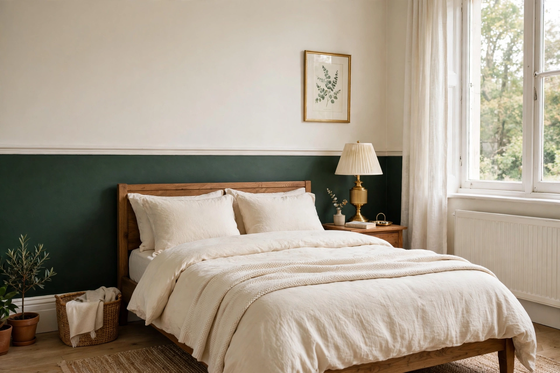
Short answer: The most flattering two tone wall ideas for bedrooms use a darker colour on the lower half and a lighter one above — split at dado-rail height (about 90–120cm) or at the midpoint for a bolder look. Paint the lower section first, use quality frog-style tape for the line, and keep ceilings and woodwork in the lighter shade. It costs one tin of paint more than a single-colour room and makes the bedroom feel designed, not decorated-by-accident.
Two tone walls are the paint trick that keeps on trending — and for good reason. Splitting a wall into two colours adds architecture to rooms that have none, hides scuffs at skirting level, and lets you use a bold colour you love without committing a whole bedroom to it. In UK bedrooms, where new-build walls are often a flat expanse of magnolia or new plaster, a two-tone scheme is the fastest way to make the room look considered.
Below are 12 bedroom-ready two tone ideas, the colour pairings that actually work, and the technique for a line so crisp it looks like wallpaper.
What Are Two Tone Walls?
Two tone walls — sometimes called colour-blocked or split walls — are walls painted in two colours with a defined horizontal, vertical or shaped boundary between them. The technique borrows from the classic designer formula known as the 60-30-10 rule: roughly 60% of the room in a dominant colour, 30% in a secondary colour, and 10% in an accent. A two-tone wall makes that ratio literal — the larger section carries the 60%, the smaller the 30% — which is why two-tone rooms photograph so well: they are balanced by construction. The split usually sits at dado height (a nod to Victorian picture rails), at the midpoint, or in an asymmetric band.
Classic Two Tone Wall Ideas for Bedrooms
1. The Half Wall: Dark Below, Light Above
The workhorse of two tone walls. Paint the lower half (or lower third) in a deep, cocooning colour — Farrow & Ball Railings, Hague Blue or Inchyra Blue — and the upper half in a warm white like Wimborne White or Dulux Egyptian Cotton. Split at about 90–120cm, roughly dado-rail height. The dark lower half grounds the bed and hides scuffs; the light upper half keeps the room airy. This is the single most bedroom-appropriate two tone scheme.
2. The Inverted Half Wall
Flip it: light below, colour above. Works beautifully with soft colours like Farrow & Ball Setting Plaster or Dulux Blush Pink on top and white below — the colour washes over the ceiling line and feels dreamy rather than heavy. Best in rooms with good natural light, since the colour sits where the light hits it.
3. The Dado-Rail Divide With Real Trim
Fit an actual dado rail (a length of moulding from B&Q or Wickes, under £20) at the split line. It gives a razor-sharp boundary, protects the wall at chair-rail height, and adds genuine period character — especially in Victorian terraces and Edwardian homes where it looks original. Paint the rail in the upper colour for a traditional look, or the lower colour for a modern edge.
4. The Statement Headboard Wall
Paint a wide two-tone band behind the bed that acts as a headboard: colour from the floor to about 150cm, white above. It frames the bed like architecture and costs a fraction of an upholstered headboard. Try deep green below and warm white above for a look straight out of a boutique hotel. For more bed-wall inspiration, see our dark green living room ideas — the colour logic transfers directly.
5. The Colour-Wrapped Ceiling
Instead of splitting wall-to-wall, run the upper colour onto the ceiling for a “wrapped” effect. The room feels cocooned and the ceiling appears higher because there is no hard white line cutting the wall. Brilliant in small box rooms where every visual trick counts — and a natural partner for our small bedroom storage ideas if you are maximising a tiny space.
6. The Vertical Split
Two colours divided vertically — usually on one feature wall. A vertical split draws the eye up and makes low ceilings feel taller. Keep the split off-centre (about a third of the way across) for a designer feel; a dead-centre split can look like a mistake. Works well behind a desk or dressing table in a bedroom that doubles as a workspace.
7. The Arch and Curve
Paint a large arch or curved shape in the second colour instead of a straight line — a painted arch behind the bed is one of the most-shared bedroom paint ideas for a reason. Use a pencil on a string as a compass for a clean curve, and edge it with tape laid in short overlapping strips. Soft, organic, and very forgiving of imperfect walls.
8. The Horizontal Stripe Band
A bold horizontal band — 30–60cm tall — in a contrasting colour, running around the room at picture height. It reads as graphic and modern, works with one tin of paint, and suits simple, uncluttered bedrooms. Keep everything else in the room quiet so the band stays the star.

Colour Pairings That Work in UK Bedrooms
Two tone walls live or die on the pairing. These combinations are proven in real bedrooms:
- Inchyra Blue + Wimborne White (Farrow & Ball): deep blue-grey below, warm white above — the classic cosy-modern bedroom.
- Railings + Ammonite (Farrow & Ball): near-black lower half with a soft grey upper — dramatic but calm, great with brass accents.
- Egyptian Cotton + White Cotton (Dulux): warm greige below, clean white above — the safe, renter-friendly two tone that suits any furniture.
- Setting Plaster + Wevet (Farrow & Ball): dusky pink below, soft white above — warm, romantic, and flattering in morning light.
- Sulking Room Pink + All White (Farrow & Ball): muted mauve below, white above — the grown-up pink bedroom.
- Denim Drift + Goose Down (Dulux): soft blue-grey below, warm grey-white above — restful and endlessly livable.
General rules: keep the two colours in the same temperature family (warm with warm, cool with cool) unless you know what you are doing; put the darker colour low in small rooms; and always test with sample pots in both daylight and lamplight before committing. For styling the finished room, our cosy winter bedroom ideas show how to layer textiles over your new walls, and our B&M home decor finds are perfect for affordable accessories that match your new palette.
How to Get a Crisp Two Tone Line
The line is everything. A wobbly boundary ruins the effect; a sharp one makes it look professional. The method:
- Paint the lighter colour first, over the whole wall, two coats. Let it dry fully.
- Mark the line with a spirit level and light pencil marks every 30cm — never trust your eye alone on a long wall.
- Apply frog-style painter’s tape (the kind that seals with paint) along the line, pressing the edge firmly with a credit card or putty knife.
- Seal the tape: paint a thin coat of the base (lighter) colour over the tape edge and let it dry. This fills any micro-gaps so the dark colour cannot bleed under.
- Paint the darker colour up to and slightly over the tape, two coats.
- Remove the tape while the last coat is still slightly tacky, pulling at 45 degrees away from the painted edge. Waiting until fully dry risks pulling paint off with the tape.
Mistakes to Avoid
- Splitting at a random height: align the line with something — dado height, the top of the headboard, a window sill — or it looks accidental.
- Two bold colours fighting: one colour should dominate. Two saturated colours at equal strength make the room feel restless, not restful.
- Ignoring the ceiling: decide whether the ceiling stays white or takes the upper colour before you start — a hard white ceiling line can undo a wrapped scheme.
- Skipping the seal coat on the tape: the single biggest cause of bleed-through. The extra ten minutes are worth it.
- Painting over unprepared walls: fill, sand and prime first — a two tone line highlights every bump the old magnolia was hiding.
Frequently Asked Questions
Where should the two tone split go on a bedroom wall?
The most flattering height is dado-rail level, around 90–120cm from the floor, with the darker colour below. For a bolder look, split at the midpoint of the wall, or align the line with the top of the headboard so the bed sits framed within the lower colour.
Which colour goes on top in a two tone bedroom wall?
Almost always the lighter colour on top and the darker below — it grounds the room and keeps the ceiling feeling high. The reverse (colour on top, white below) works only with soft, pale colours in well-lit rooms.
Can you do two tone walls in a rented bedroom?
Yes, with permission or a repaint-on-exit agreement. Use peelable FrogTape-style products for the line, keep to colours the landlord would accept, or use removable painted arch decals for a zero-paint two tone effect. Photograph the original walls first.
What paint finish should I use for two tone bedroom walls?
Matt or modern emulsion for both colours — it hides imperfections and gives the flat, contemporary finish two tone schemes need. Use the same finish on both colours so the line reads as colour, not sheen. Reserve silk or satin for woodwork only.


